Create design principles and strategies to increase efficiency and consistency among country-specific features designed by local teams in China, India, and the US.
Responsibilities
I played a crucial role in creating UX principles and guidelines for the global markets and validating interfaces based on internal design systems through iterations with designers from local branches to ensure consistency.
Results
The redesigned Samsung Pay was released starting from Korea in September 2018, and refined global guidelines have been implemented. We observed a 10% increase in overall app usage timeand a 9% growth in active users among services in China and the US.
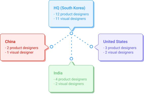
After Samsung Pay launched in 24 markets, contactless and mobile payment adoption has accelerated significantly. The app has evolved beyond being a wallet; it has offered additional services, and the local teams even managed some country-specific features. Several separate project managers, developers, and designers have worked on the app in China, India, and the US.
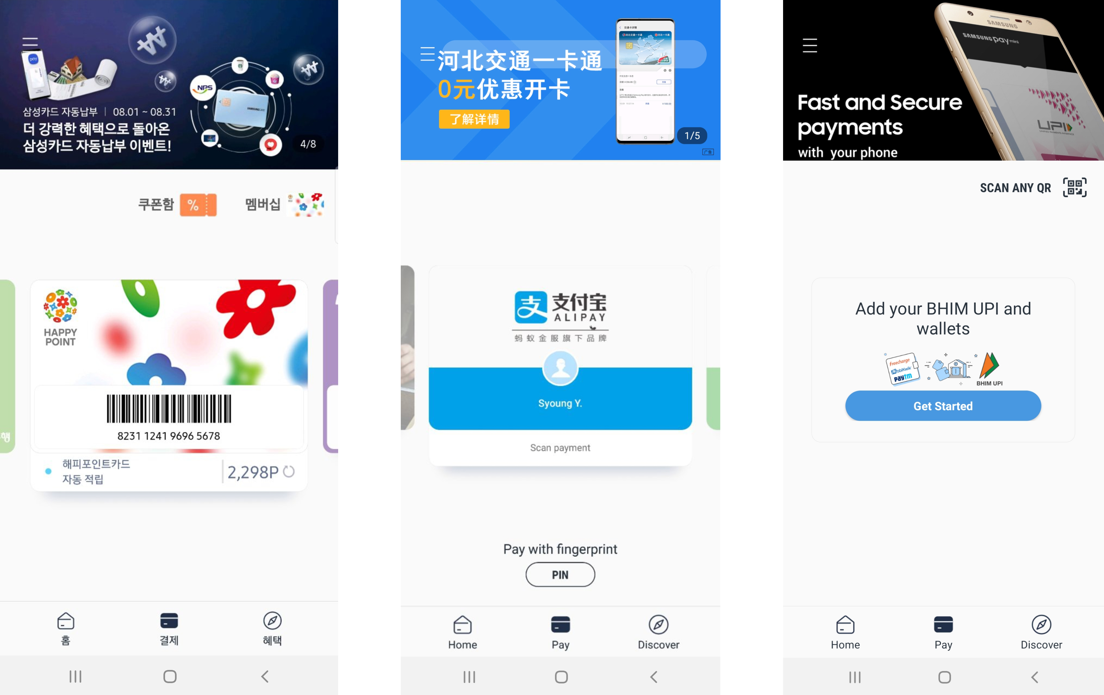
As local team members introduced more country-specific services, different experiences by country increased.
Since the app has many features, some users had difficulty finding what they wanted to use. These could be accessed by the app home in the grid list, but data also showed that most users exited the app after they completed payment transactions. So, internal stakeholders constantly requested to make each feature more discoverable.
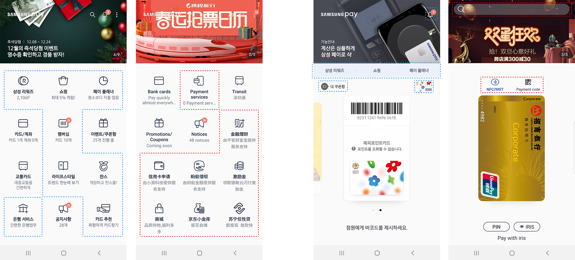
[Different features between Samsung Pay in Korea(left) and China(right)]
Project approach
It was essential to devise systematic principles to create a simple and understandable design to ensure usability and consistency across different countries. Additionally, making it easier for users to access additional information will increase the number of active users and usage time. Our team established UX principles and internal guidelines to draft design improvements.
Collaboration with designers
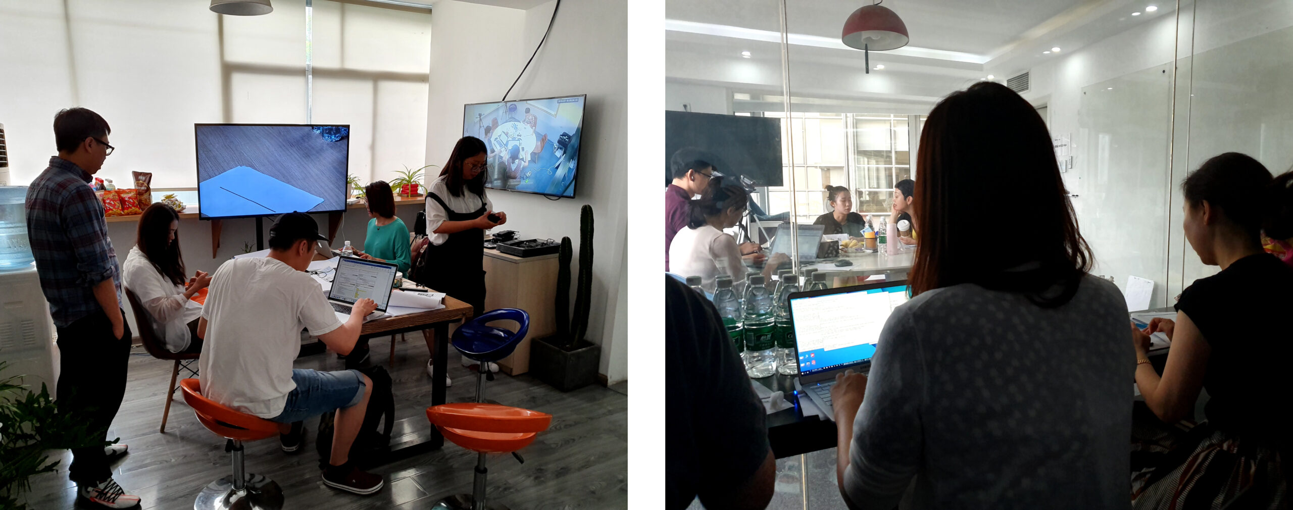
I began working with designers from different countries to ensure alignment and gain a better understanding of each country’s perspectives. Our team arranged annual workshops in South Korea, where we could collaboratively develop an approach that would meet the expectations of all stakeholders.
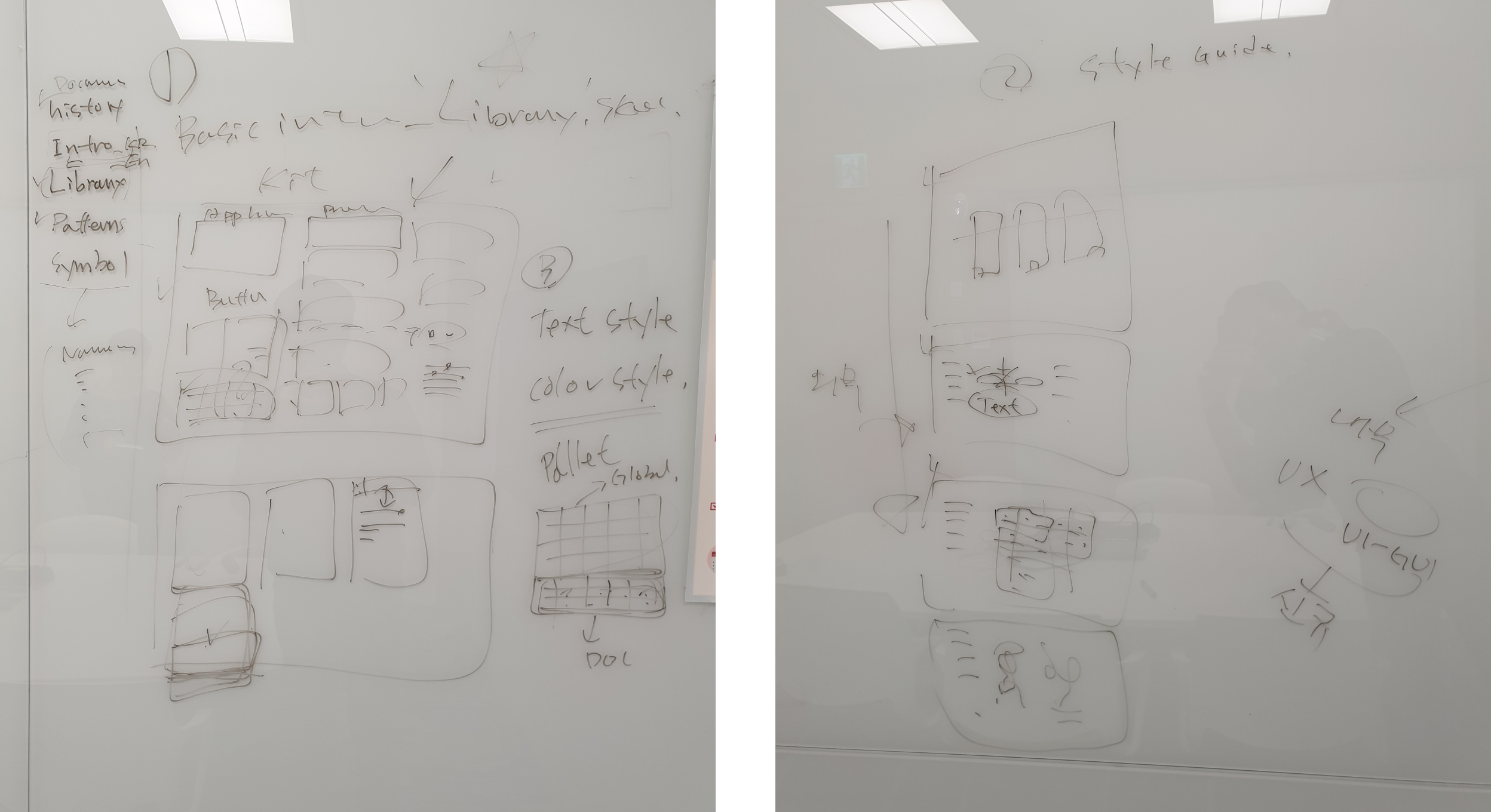
[Initial sketches for creating an internal design system]
Also, as a part of our efforts to gather feedback from diverse customers, we conducted several user research studies in China and the US through partnerships with local teams.
Design Exploration
Our team identified three primary objectives based on user research and workshop results.
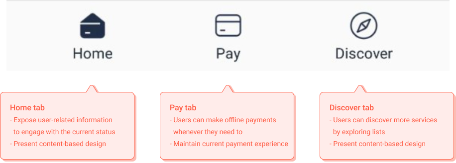
Users should be able to make payments whenever necessary without disrupting the current payment experience.
Expose user-related information prominently to increase the likelihood of noticing and engaging with current status.
Present content-based design to discover more services through exploring lists.
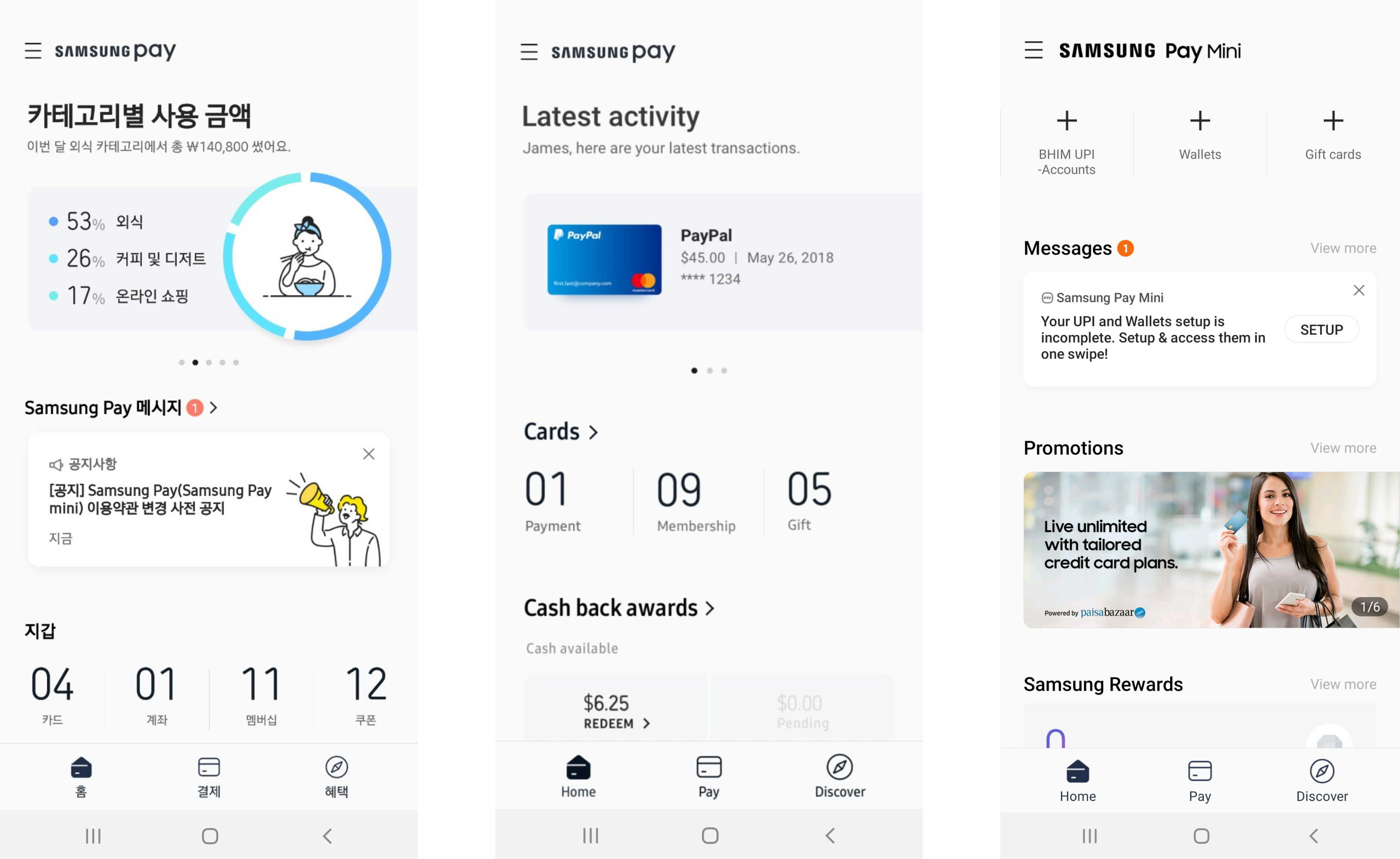
So, we added a bottom bar with three task-focused tabs based on these objectives: Home, Pay, and Discover. It lets users quickly access each tab and find other services, even from the card payment screen.
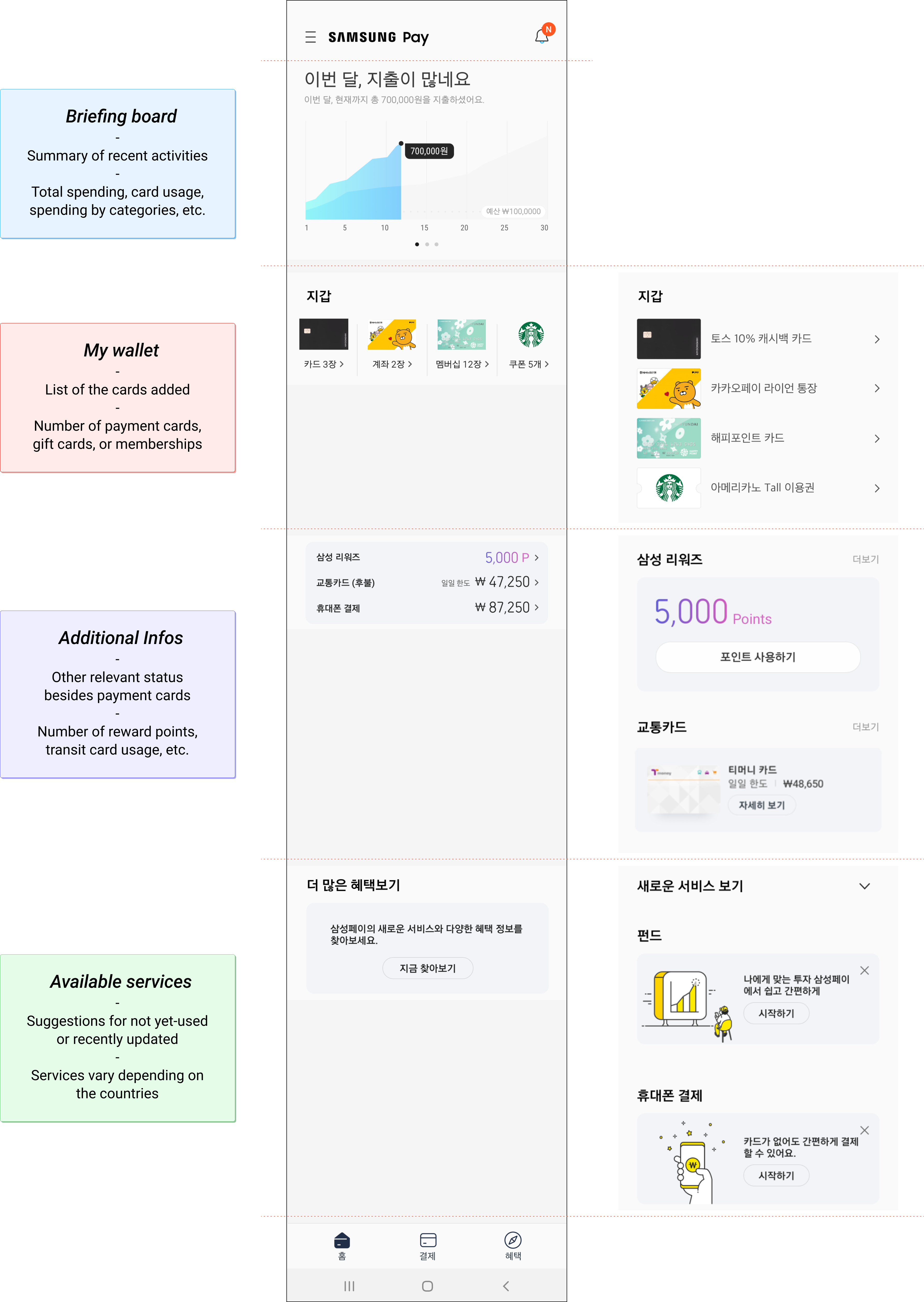
Our team created and tested several variations to determine how to display current activities on the Home tab, including transaction amounts, registered cards, or rewarded points. Our goal was to ensure that users could easily view their information while also being able to discover new services and promotions.
I also provided guidelines to the local teams on the new concepts for these task-focused tabs and internal design systems to ensure a consistent user experience. Some local designers requested customization of specific screens based on the regional product manager’s requirements. I collaborated with them through iterations to validate variations to meet their service priorities.
The final product
While developing the new concepts, we worked closely with local teams to ensure that the content in each tab meets the unique needs of various regions. Users can now easily access recent activities or promotions tailor-made for their perspectives. The collaborative efforts of all stakeholders with diverse viewpoints resulted in the best solution for our customers.
Starting from Korea in September 2018, the redesigned Samsung Pay was released globally. We observed a 10% increase in overall app usage time and a 9% growth in active users among services in China and the US.
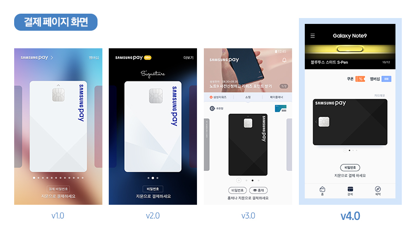
[Payment screen variations in Korea(first), China(middle), and India(last)]
[Home screen variations in Korea(first), the US(middle), and India(last)]